

The project itself:
Project Overview
Shakiba is a self-initiated 0→1 concept for an iOS and Android habit tracker, built around a core insight: most habit apps solve the wrong problem. They track streaks and guilt-trip users when they break them. Shakiba treats consistency as a systems problem, not a willpower problem. The result is a dark glassmorphism UI, zero-friction onboarding, local-first data, and a calm visual language that feels premium from the first launch.
Problem:
Existing habit trackers are built around streaks. When a streak breaks, users abandon the app entirely. The visual design of most trackers is clinical and anxiety-inducing. They feel like accountability tools rather than personal operating systems. None of the apps I reviewed (Streaks, Habitica, Done, Finch) combined a native-feeling mobile UI with a calm, flexible approach to routines.
Goal:
Design a mobile habit tracker that feels like it belongs on your home screen: premium, calm, and zero friction. Get users to their first completed routine in under 30 seconds, sustain engagement through visual progress rather than streak anxiety, and work completely without an account or subscription.
My role:
Sole designer: concept, research, IA, UI, design system, and prototype. Built entirely from first principles with no brief, no product manager, and no existing codebase to reference.
Responsibilities:
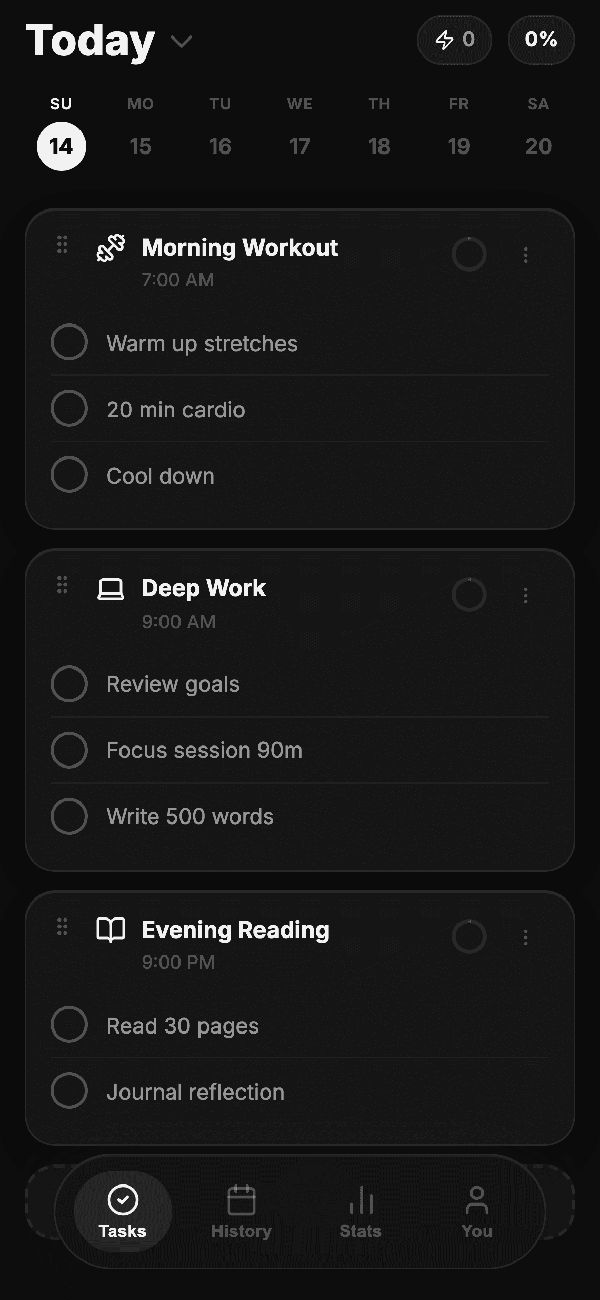
I made three product calls. Dark mode is the main look, not a toggle. Data stays on the phone with no account, which gives up cross-device sync in exchange for no signup at all. And the core screen is Today, because the job is finishing today's habits.
All about the user:
User Research
I mapped the competitive landscape across Streaks, Habitica, Done, and Finch, then interviewed five people who had used and abandoned at least two habit apps. None of them had quit for lack of willpower. They quit because the apps made them feel like failures. The insight that shaped the design: the app should work for you on your best day and still be there, without judgment, on your worst.
Pain Points
Streak anxiety:
Missing one day felt catastrophic. Several participants said they stopped using their habit app entirely after breaking a streak, not because they had given up on the habit, but because the visual punishment made them avoid opening the app.
Setup friction:
Most apps required account creation, onboarding surveys, or category selection before showing any value.
Visual mismatch:
Participants who had premium apps on their home screen (Notion, Spotify, Fantastical) said existing habit trackers looked out of place. The design language of most trackers felt like productivity software, not a personal tool.
User Journey Map
End-to-end journey from first launch to a completed daily routine, built from interview data and prototype testing sessions.
I mapped the journey from installing the app to completing a first full week of habits, tracing where users stalled (empty state on launch), where they gained confidence (first completion animation), and where they dropped off (no recovery path after missing a day). The map directly informed the empty state redesign and the no-streak-punishment decision.
Goal
Build and maintain a daily routine that fits into real life, without anxiety, without an account, and without starting over from zero after one missed day.

The project schematically:
Starting the Design
I started with one constraint: a new user must see completed value within 30 seconds of first launch. No account and no survey. That constraint eliminated most conventional app structures. I sketched three IA directions, wireframed two, and validated the core loop with five users before touching colour or type. The decision to make dark mode the primary experience (not a toggle) was the hardest call. It defined the entire visual system and meant every component had to be designed for dark first.
Sitemap
Four screens. Today, Habits, Progress, Settings. Every core action reachable in one tap from Today.
Today (home) → Habit list → Add/Edit habit → Progress dashboard → Settings. I kept the nav to four tabs and removed any concept of a backlog or archive: habits either appear today or they do not. This reduced decision fatigue at the surface level.

I tested two approaches to the Today view: a list-based layout (similar to Reminders) and a card-based layout grouped by routine category. Users consistently preferred cards. They felt more like a personal system and less like a task manager. That validated the card model before I touched any colour.



Usability Studies
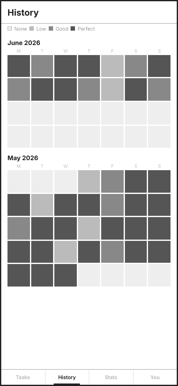
Unmoderated sessions with five participants testing the low-fidelity prototype, focused on onboarding speed, Today view clarity, and habit creation flow.
I ran unmoderated sessions testing the low-fidelity prototype with five participants across student, professional, and freelancer profiles. Three findings directly changed the high-fidelity direction.
Empty state confusion:
Three of five participants did not know what to do when they first opened the app. The blank Today view gave no signal about what the first action should be. This directly led to the guided empty state: a single prominent CTA to add your first habit.
Habit creation friction:
The original habit creation flow had four steps. Two participants abandoned it before completing. I cut it to two steps (name and schedule), deferring category, colour, and icon to an optional edit screen.
Progress legibility:
Participants could not immediately tell how many habits they had completed today vs how many remained. The completion ring on the Today header wasn't visible enough. I increased its size and added a numerical count. Both changes went into the high-fidelity screens without further testing.
The clear version:
Refining Design
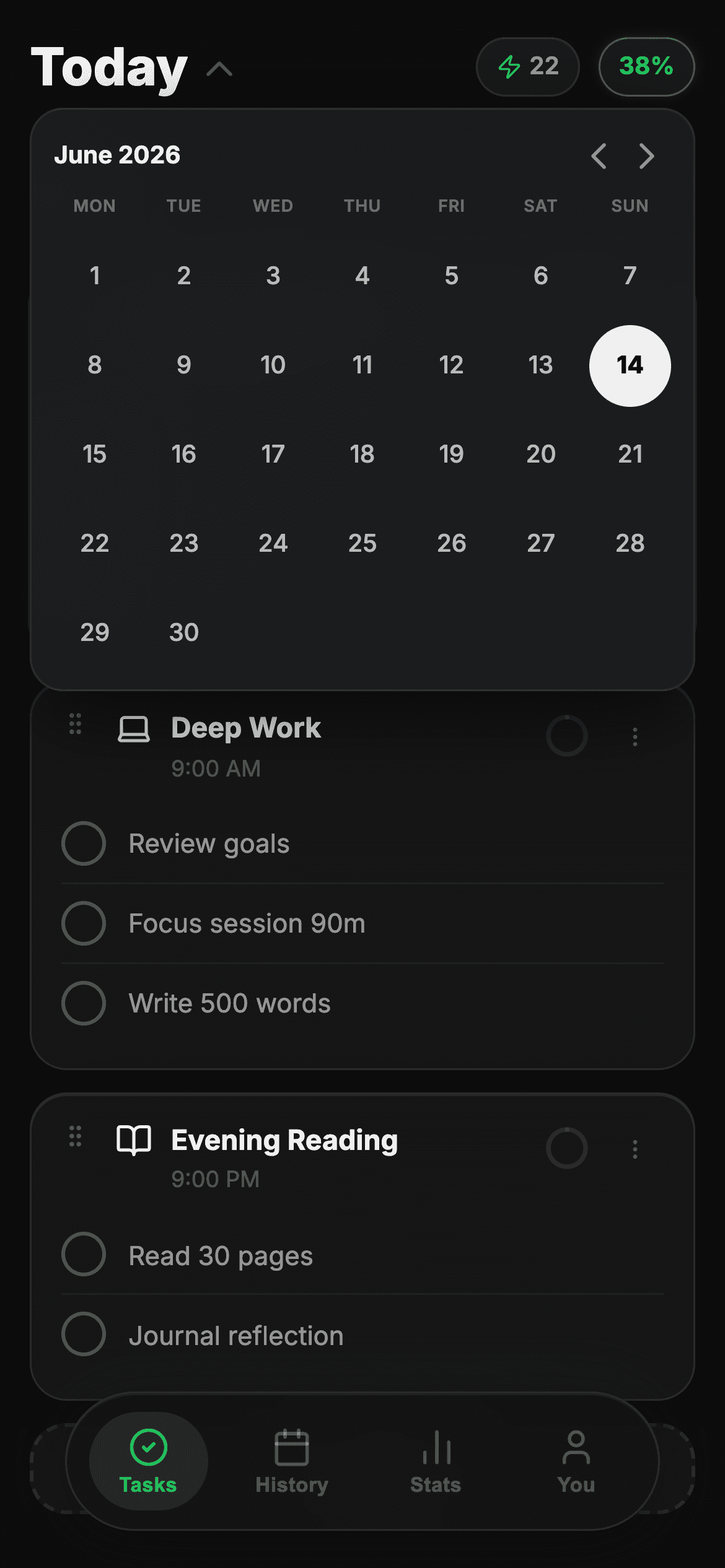
With wireframes validated, I moved to high-fidelity UI. Glassmorphism gets called a trend, and fair enough. I used it here for a practical reason: dark UI has a hierarchy problem (borders look harsh, shadows barely read), and frosted, translucent cards were how I got depth and separation without adding visual noise. Every component was designed dark-first, then checked for legibility across different ambient light.
Mockups
Core flows: Today view, habit creation, progress, and onboarding.
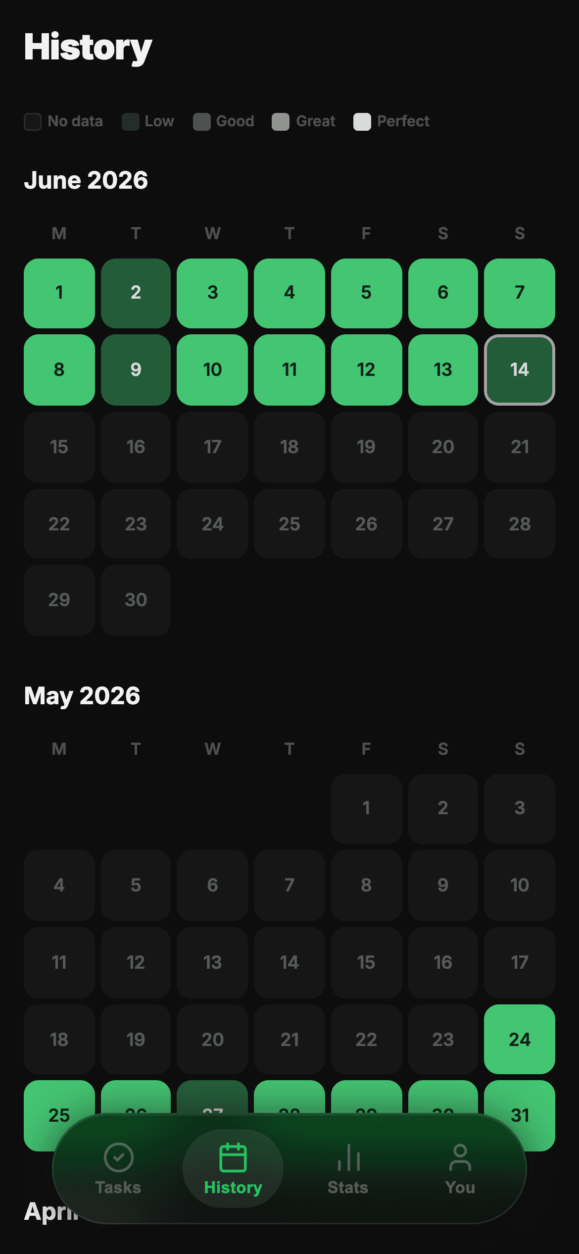
I designed all core screens with a glassmorphism dark system: frosted cards, translucent panels, and deep background layers. Every element was built dark-first, then validated for legibility at different brightness levels. The 10 screens below cover the complete user journey from first launch to reviewing weekly progress.


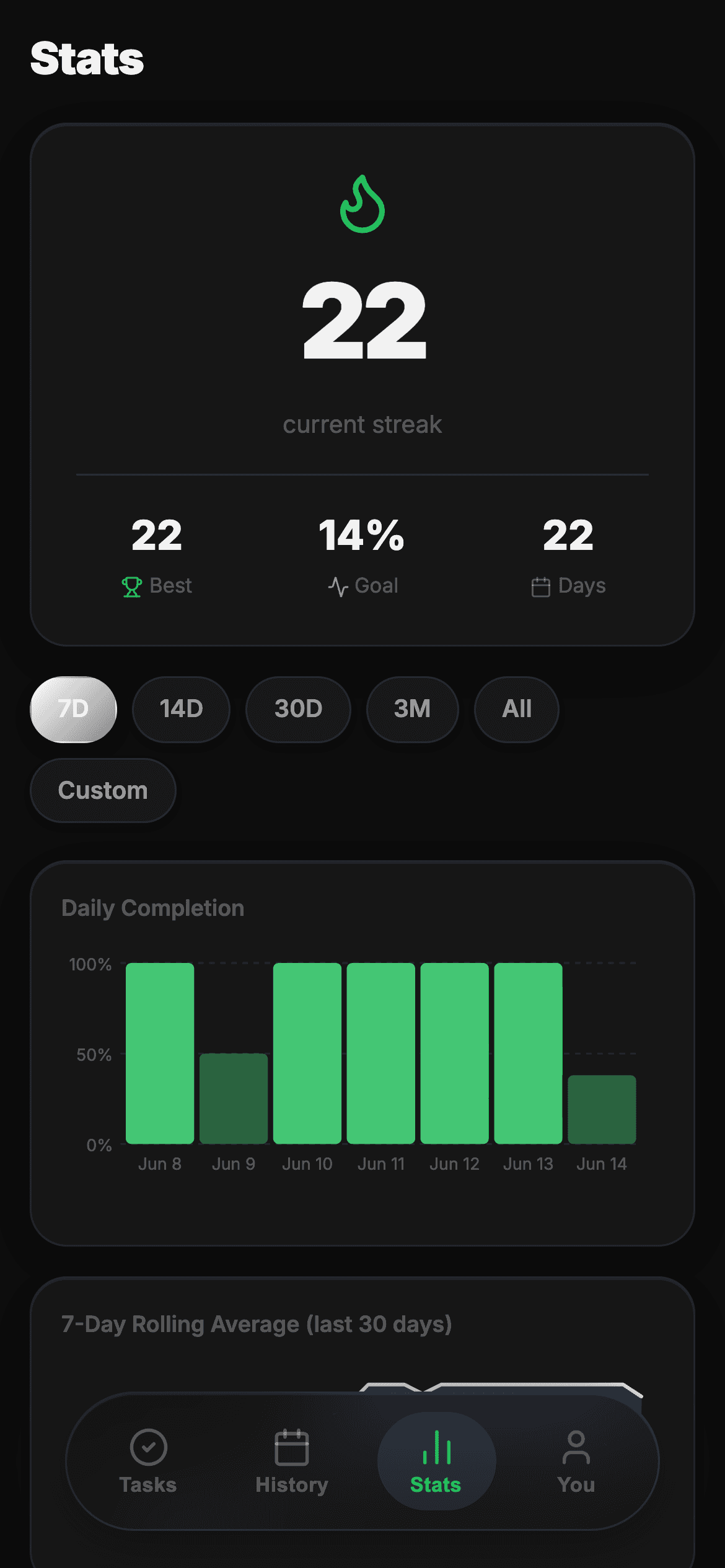

High-fidelity prototype
Interactive Figma prototype covering the full onboarding, Today view, habit creation, and Progress flows.
The prototype uses native iOS gestures throughout: swipe to complete, long-press to edit, pull-to-refresh on Today. Motion was used deliberately. Completion animations are satisfying without being distracting. The prototype was used in the second round of usability testing to validate the empty state and habit creation fixes.

Onboarding flow, Today view, habit completion animation, and Progress dashboard.
The project schematically:
Outcome
Shakiba is a complete iOS and Android concept, with a design system, all core flows and an interactive prototype. The zero-friction onboarding goal was met: the path from launch to first completed habit requires no account, no survey, and no permission gate.
Takeaways
What designing a 0→1 consumer mobile app taught me.
The 30-second rule:
The 30-second onboarding rule did most of the product-direction work for me. Accounts, surveys, category pickers, whole categories of conventional onboarding just fell away because they couldn't fit inside it. I set the constraint myself, which is probably why it held. Dark-mode-first was a positioning call more than a styling one: the people I interviewed kept Spotify and Fantastical on their home screens, and Shakiba had to look like it belonged next to them.
What I learned:
No account system meant the architecture had nowhere to hide state, so it came out cleaner. The narrow phone canvas meant hierarchy either worked at that width or it didn't.
Next Steps
If I kept building it.
Cloud sync:
Add optional cloud sync, maintaining the local-first default but unlocking cross-device continuity for users who want it, without requiring an account.
Flexible scheduling:
Allow habits to be scheduled on specific days or intervals, moving from daily as the default to a fully flexible system that reflects how real routines work.