


The project itself:
Project Overview
Otio is a consumer AI research workspace where people upload documents, organise them into Spaces, and chat with their sources to get cited, traceable answers. As Senior Product Designer, I led V2 (a full redesign of the web experience across Chat, Library, Navigation, and Spaces) and replaced a web-wrapper mobile app with native iOS and Android apps. Otio's web app reached about 69,000 monthly active users, and after V2, Chat was the most-used action, about 4x the next.
Problem:
Subscription growth was underperforming and churn was rising. Behaviour data and user feedback showed that users struggled to reach value quickly due to friction in key flows, unclear guidance, and a scattered experience. The product needed simplification and stronger prioritisation, without adding more complexity.
Goal:
Create a more intuitive experience that helps users reach value faster, improves the conversion journey, and reduces churn by removing key friction points. Align the V2 feature set with real user needs and technical feasibility through research, prioritisation, and iterative design.
My role:
Senior Product Designer responsible for the full Otio design function, across web and mobile. I owned the V2 web redesign across Chat, Library, Navigation, and Spaces, and replaced a web-wrapper mobile app with a proper native iOS and Android experience. I worked directly with the co-founder and engineers to define scope, ran research independently, and set the design direction across both platforms simultaneously.
Responsibilities:
Made the call to merge Library and Chat into one workflow after research showed people treated them as separate tools. Replaced the web-wrapper mobile app with native apps built on the V2 web component system, so web and mobile stayed consistent. Ran a co-founder workshop to cut V2 scope, removing three planned features that couldn't be delivered without fragmenting the core experience.
All about the user:
User Research
To understand why Otio was not converting and retaining as expected, I focused on one question: why were users not reaching value fast enough? I paired Hotjar and analytics with FigJam discovery to map the jobs users hired Otio for, the steps they took, and where they got stuck. Uploading was easy. The next step was never clear. Users wanted a guided path from upload to useful output, with stronger trust in answers and clearer control of sources. The biggest opportunities were simplifying the Library-to-Chat handoff and improving multi-document reliability for research-heavy users.


Pain Points
Source to knowledge gap:
Users could upload plenty of files, but struggled to turn them into structured knowledge. They needed clearer source linking and easier cross-document navigation, and some were unsure what made Otio meaningfully different from other AI tools.
Post-upload confusion:
After upload, many users did not know what to do next. The relationship between Chat, Library, and Workflows felt unclear, and early complexity made onboarding feel heavier than it needed to be.
Answer reliability:
Trust was the deciding factor. When users worked across multiple documents, answers sometimes felt limited or unreliable, which reduced confidence quickly.
User Personas
I built the personas around the jobs people hired Otio for, and tied each one to the reason they'd keep paying for it.



User Journey Map
From first landing in Otio to an answer worth reusing, and the three places people stalled on the way.
The map follows a user from first landing to an answer they'd reuse. Three stall points kept showing up: right after upload, where there was no obvious next action; mid-chat, where people couldn't tell if the answer came from their sources or the model's general knowledge; and at the end, where there was no clear way to save or export what they'd got.
Goal
Upload and organise sources, ask questions with confidence, and leave with a clear output you can share or export.

The project schematically:
Starting the Design
One requirement sat under everything in V2: Library and Chat had to work as one workflow, not two separate surfaces. Research showed users were uploading sources then switching to Chat as if entering a different product. The mental model was broken at the seam. The workshop with the co-founder and engineers was mostly about cutting scope. What survived it: one Space model, so sources and conversation live in the same context; a guided first action instead of the open-canvas empty state, because the activation data made that an easy call; and a native mobile app built on the V2 web component system. The mobile decision was the fight: engineering wanted another web-view because it was faster to ship. I dug in, because the existing web wrapper was the problem we were replacing, and shipping a new wrapper would have contradicted the whole point of V2.
Sitemap
Space-based IA: one Space per research problem, with Library, Chat, and Outputs always in the same place.
I designed Otio's IA around a single idea: each Space represents one research problem. Early testing showed users were slowed by too many entry points and unclear boundaries between chatting, saving, and writing. I simplified this into a three-step flow inside every Space (Library for sources, Chat for exploration, Outputs for reusable work), so users always know where they are and what to do next.

Concept Explorations
Three layout directions tested: navigation model, content density, and entry point hierarchy. One direction won on clarity and scalability.
These concepts tested different ways to structure navigation, reduce complexity, and clarify how key actions fit together. After reviewing against the core V2 goals, we selected one direction, prioritising entry point clarity and consistent spatial logic across Library, Chat, and Outputs.

Low Fidelity Wireframes
Figma wireframes mapping the Space workflow (Library, Chat, and Outputs) to validate hierarchy and edge cases before moving to high-fidelity.
Using Figma, I mapped the main screens and interactions across the Space workflow, from organising sources in Library, to exploring in Chat, to turning insights into Outputs. This confirmed hierarchy, navigation patterns, and edge cases early, before committing to high-fidelity UI.

Usability Studies
Unmoderated sessions testing the low-fidelity V2 prototype, focused on navigation clarity, source-to-chat handoff, and trust in AI answers.
I ran unmoderated sessions with users across researcher, consultant, and knowledge-worker profiles, testing the low-fidelity V2 prototype to surface navigation friction, confusion at the Library-to-Chat handoff, and trust gaps in AI answers. Three findings shaped the high-fidelity direction directly.
Navigation confusion:
Users didn't know where to go after uploading a source. The relationship between Library, Chat, and Spaces wasn't clear. Several participants tried to start chatting from the Library screen directly, then got confused when nothing responded.
Trust in answers:
Participants questioned whether AI answers were pulling from their uploaded sources or general knowledge. Without visible citations or source indicators, several said they wouldn't act on the output in a real work context.
Empty state paralysis:
New users landing on an empty Library or Space didn't know what to do. Without a clear first action (upload a file, start a chat, create a Space), several participants stalled completely and one said they'd close the tab and come back later.
The clear version:
Refining Design
High-fidelity happened across web and mobile at once, and most of the work at this stage was agreement rather than pixels. I ran a review with the co-founder and engineers, laid out the reasoning behind each direction, and we settled what shipped and what got cut. What came out the other side was a V2 where Library, Chat, and Spaces finally read as one product instead of three features parked next to each other.
Mockups
Before and after: the web-wrapper replaced by a native app, and a fragmented web experience unified into a single V2 product.
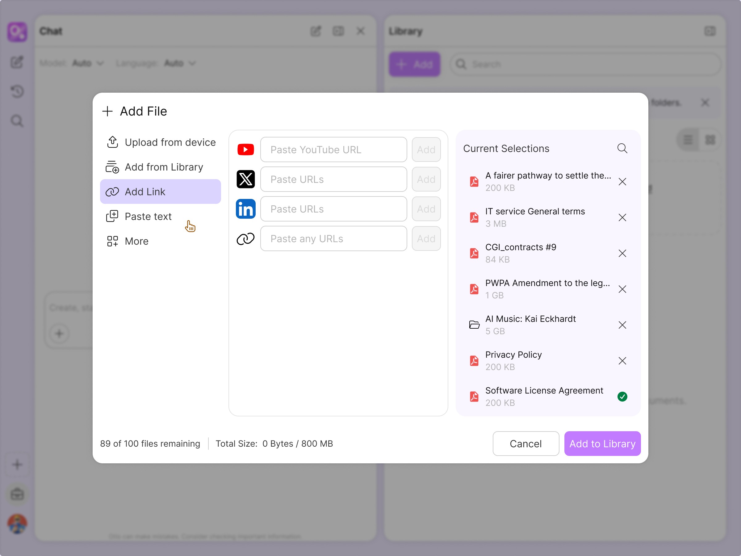
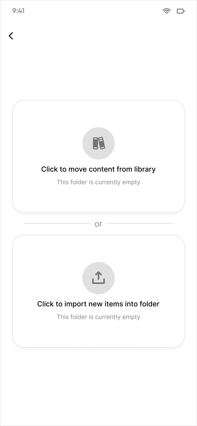
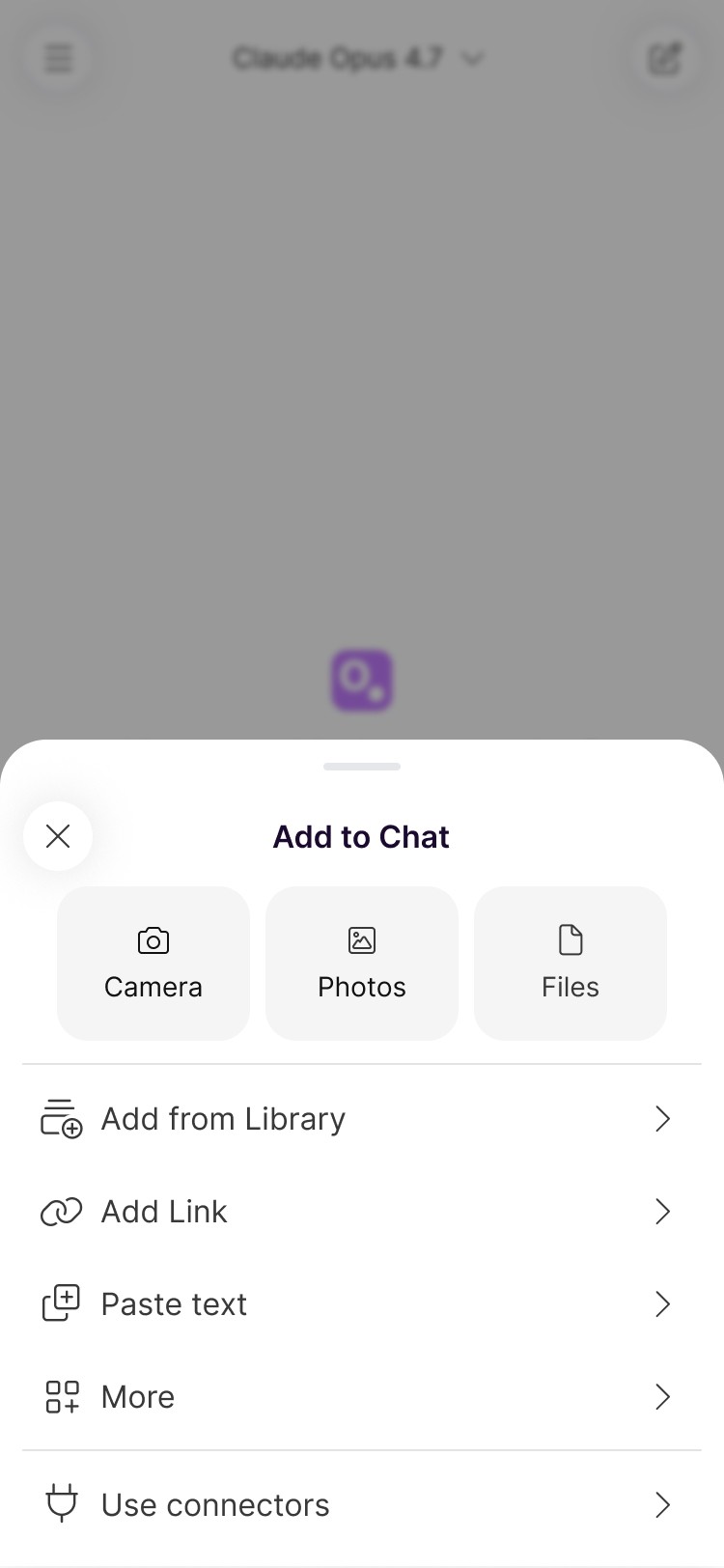
The before state: a web-wrapper mobile app, a fragmented web experience where Library and Chat felt like separate products, and an empty state that left new users with no clear first action. The after state: a unified V2 web experience where sources, chat, and outputs live in one Space; a native iOS and Android app built on the same component system; and a guided empty state that drives users toward their first upload.
Web
← Before
Fragmented web experience before V2


→ After
V2 redesigned web experience



Mobile
← Before
Web-wrapper mobile app



→ After
Native iOS and Android app



High-fidelity prototype
Web and mobile flows showing the V2 redesign: unified Library and Chat, source upload, and the native iOS experience replacing the web wrapper.
The prototype covers the core V2 flows: uploading a source, organising it into a Space, asking a question in Chat, and getting a cited answer. It also shows the native mobile app replacing the old web wrapper: the same source-to-chat workflow in a properly native iOS context. Used to validate the unified Library and Chat model with users before engineering handoff, and to demonstrate the mobile direction to the co-founder during scope alignment.

The project schematically:
Outcome
Otio's web app reached about 69,000 monthly active users. I replaced the web-wrapper mobile app with native iOS and Android apps and shipped the V2 web redesign across Chat, Library, Navigation, and Spaces, all from one component library.
Takeaways
What I'd keep from V2, and what I'd change.
What V2 got right:
Merging Library and Chat worked for people who had already organised their sources: after V2, Chat was the most-used action, about 4x the next. Getting people to upload their first source was the harder problem, and it's the one I'd take on next.
What I learned:
Running the native mobile build and the web redesign at the same time was an education. iOS wouldn't let me get away with things the web tolerated, and every time the platform pushed back, the design came out simpler. The number that bothered me for weeks: 83% of signups never uploaded a source. The ones who did took under 4 minutes, so the task wasn't hard. People just never found out it was the thing to do. That's an activation problem you fix with design.
Next Steps
Two problems V2 left open.
Improve mobile activation:
Only 11.9% of mobile users upload a source within 7 days. The next step is redesigning the mobile empty state and first-run experience to make the first action obvious: guided upload with a single clear CTA rather than an open canvas.
Make citations the default:
Usability testing showed users wouldn't act on answers they couldn't verify. Next: show sources inline by default, with a visible confidence signal on every chat response.