Definely
Definely
Region
Region
UK
UK
Year
Year
2023 – Present
2023 – Present


The project itself:
Definely is a legal productivity platform inside Microsoft Word, built to help lawyers draft faster, review with confidence, and reuse high-quality precedent. As founding designer, I led UX and UI for four core products: Draft, Proof, Vault, and Enhance. Alongside the navigation redesign, activated users grew from 6,441 to 16,856 (+162%), and the design system I built stayed consistent as the company grew from 30 to 100+ people.
Lawyers work where small mistakes are costly. They switch context all day, work in long documents, and have little patience for ambiguity. Early versions had unclear entry points, crowded panels, and nothing that showed where an AI answer came from. The products had to feel predictable and grounded in evidence without pulling people out of Word.
Create a cohesive, scalable experience across Draft, Proof, Vault, and Enhance that reduces cognitive load and helps lawyers move from question to verified action. The experience needed to make key workflows discoverable, keep users oriented inside complex documents, and provide confidence through clear references, history, and transparent system behaviour.
As the founding and sole designer for two years, I owned the full design function, from early discovery through to engineering handoff and post-launch iteration. I set the design direction for four products at once, ran user research myself, built and maintained the design system, represented design in product planning and roadmap prioritisation, and designed the investor pitch deck. I worked directly with the CEO and CPO to define what we built and why, and with engineering teams of two to five people per product to ship production UI.
Unified four separate product surfaces under a single IA instead of improving each one on its own, putting coherence ahead of shipping speed. Built a cross-product design system from 0 to 50+ components, all on Figma Variables I named with the engineers. The codebase uses the same names, and engineering builds from the system. Designed AI trust patterns (provenance links, history, and transparent controls) after usability data showed lawyers would not act on outputs they couldn't verify.
All about the user:
To understand lawyer workflows in Word, I ran qualitative interviews, analysed product analytics, mapped end-to-end workflows, and audited the existing UI across all four products. I could have fixed the surface friction product by product. But the research kept pointing somewhere else: people understood each feature fine in isolation and still got lost moving between Draft, Proof, Vault, and Enhance, because nothing gave them a single mental model of the whole thing. So I redesigned the underlying system instead. Slower, and it set up every decision that came after.
Users could draft and edit comfortably but struggled to verify definitions, citations, and precedent across long documents. Finding authoritative sources and seeing how content connected required extra work. Missing provenance, defined-term linking, and reliable Vault integration left users unsure whether an answer was trustworthy.
After edits or AI responses, many users didn't know the next step. The handoff between Draft, Proof, Vault, and Enhance felt fragmented, with duplicated controls and inconsistent panels. Annotation and PDF workflows were clumsy, and the lack of button-led, guided entry points made tasks harder than they needed to be.
Trust and predictability were decisive. AI outputs and automated checks often felt opaque or untraceable, and unclear permissions for cross-document queries raised risk. Sharing work was harder than it should be, because access, history, and versions were hard to see. Inconsistent UI patterns across products undermined confidence.
Five personas, one per real workflow: Associate (speed + accuracy), Partner (trust + traceability), Knowledge Manager (curation + precedent), Paralegal (admin + bulk actions), Researcher (multi-doc + permissions).



From first landing in Definely to an output a lawyer trusts enough to reuse.
I stitched the map together from Hotjar recordings, funnel analytics, surveys, interview notes, and a pass through competitor flows. The recordings did most of the work: hesitation shows up on tape in a way a funnel chart never quite captures.
Button-led workflows and clear next actions to shorten paths to value · Inline provenance and defined-term links so outputs are verifiable · Cross-product design system for consistent panels and reversible, traceable outputs

The project schematically:
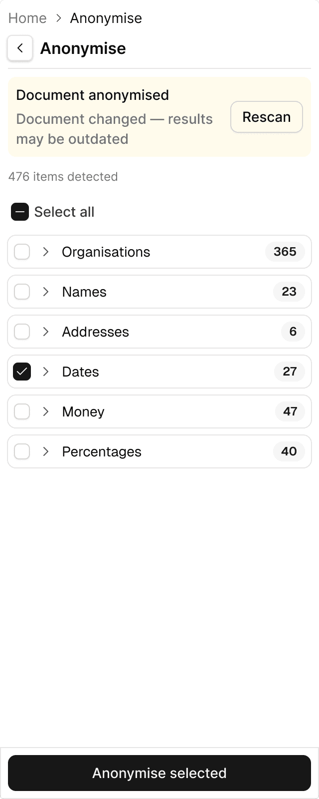
I approached the redesign with one structural constraint that shaped all decisions: we were building inside Microsoft Word's add-in environment, locked to a 320px panel. Every conventional design pattern (sidebars, modals, multi-column layouts) was off the table. The bigger problem was the architecture. Definely had five tabs (Cascade, Draft, Proof, Vault, and Enhance), each operating as a standalone product. Users had to enter each tab to discover what lived inside, and the tabs had no awareness of each other. Completing a real legal workflow meant manually switching between surfaces that didn't share context. I ran a cross-functional workshop with product and engineering to align on V2 priorities and eliminate scope. From that session I made three calls. Cascade becomes one entry point that brings up tools from Draft, Proof, Vault, and Enhance for whatever the user is working on. Every workflow starts with a button instead of a text field, to lower the cost of starting. And the shared component library comes before any new UI. The alternative was faster to ship but would have compounded the existing fragmentation problem.
Built from 0 to 50+ components, fully documented in Figma, adopted by engineering, PM, and marketing as the single source of truth.
Before the design system, every sprint produced inconsistent UI. The components sit on Figma Variables that use the same names as the code, so designers and engineers work from one vocabulary.
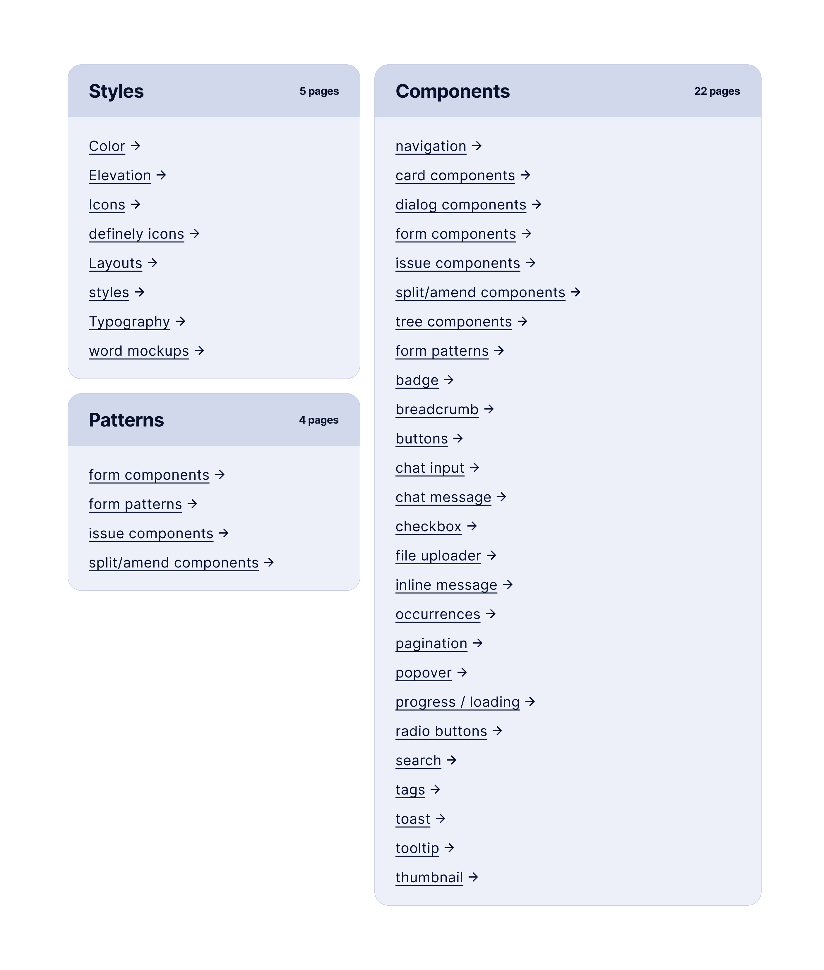
Design system overview: 31 pages across 4 categories (Styles, Components, Patterns, and Documentation).
Component specifications: card components with states, options, and interaction notes documented for engineering handoff.

Card component explorations: before/after iterations showing how design decisions evolved through critique and testing.

TagPicker component: all states documented (default, hover, active, disabled, loading, error), with component panel options.
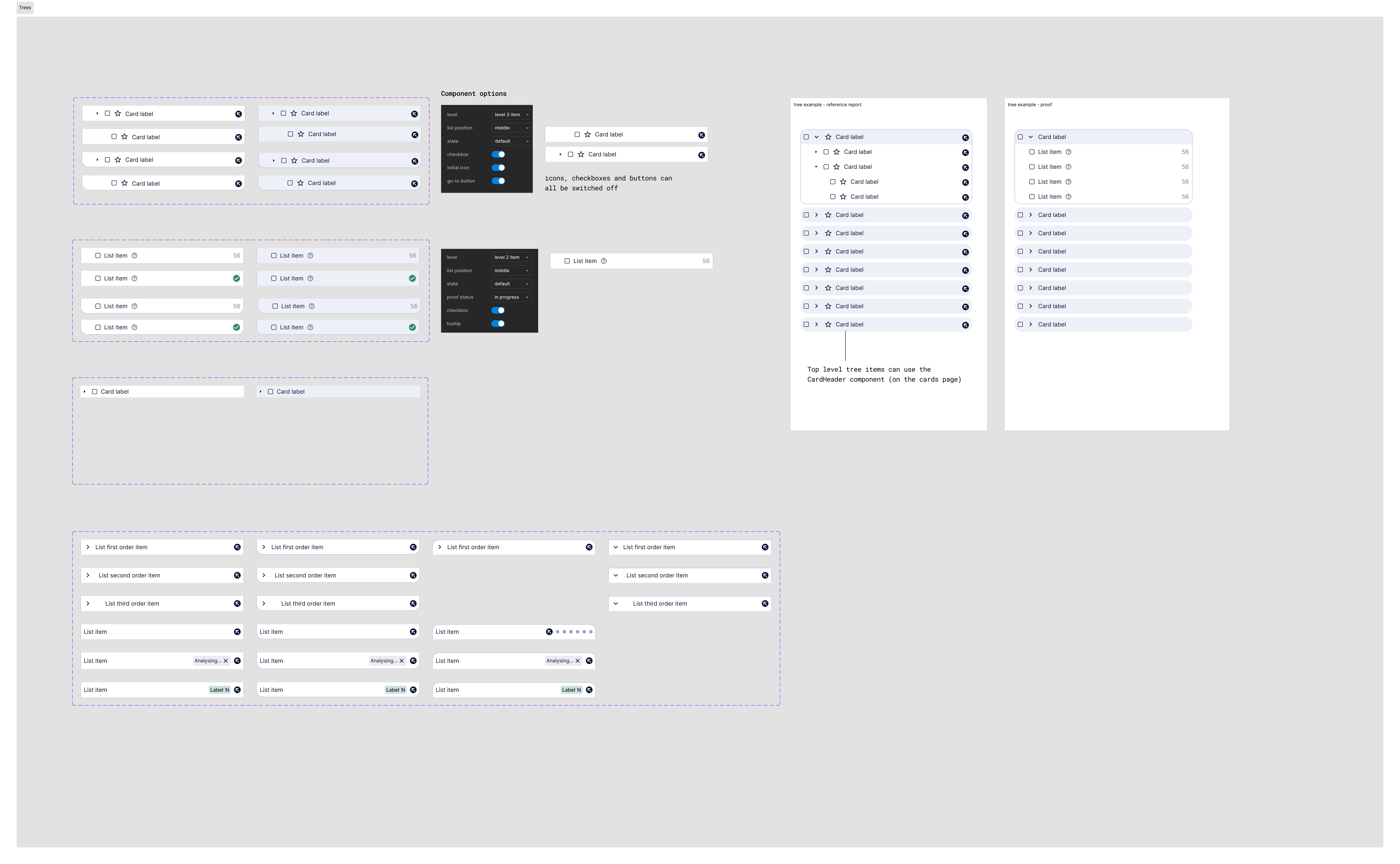
Tree components: hierarchical list patterns used across Draft, Proof, and Vault for document and clause navigation.
Core pages and primary navigation paths across Draft, Proof, Vault, and Enhance inside Word.
Home / Word document context · Document canvas and toolbar · Global search and quick actions · Draft panel (editor-integrated drafting tools, clause library inline insert) · Proof panel (automated checks, issue list, inline suggestions) · Enhance panel (button-led workflows for ask, summarise, and draft, inline provenance and defined-term links) · History and Outputs (past chats, generated outputs, export and version history) · Settings and Account (permissions, model preferences, subscription)

Rapid sketches and layout experiments to find where quick actions, provenance, and panel grouping should live, validated through team critiques to choose a single direction balancing discoverability, minimal switching, and reusable components.
I sketched and tested several layout and interaction directions to reduce visual complexity and make core actions obvious inside Word. The experiments explored where to surface quick actions, how to group draft, review and research controls, and how to show provenance and defined-term links inline. I ran rapid critiques with product, engineering and customer stakeholders to compare trade-offs. From these explorations we picked a single direction that balanced speed, clarity, and scalability.

Low-fidelity Figma wireframes mapping Draft, Proof, Vault and Enhance flows to validate hierarchy, edge cases, and button-led entry points, iterated with users and engineers before moving to high-fidelity UI.

Moderated sessions with lawyers across Associate, Partner, and Knowledge Manager roles, testing core flows to surface friction, confusion, and trust gaps before high-fidelity.
I ran moderated usability sessions with lawyers across Associate, Partner, and Knowledge Manager roles. Sessions tested core flows across Draft, Proof, Vault, and Enhance to identify friction, confusion, and trust gaps before moving to high-fidelity.
Users couldn't tell where AI outputs came from. Missing source links and defined-term connections made lawyers hesitant to act on suggestions. They needed to see the evidence before trusting the result.
The five-tab structure (Cascade, Draft, Proof, Vault, and Enhance) meant users had to enter each tab to discover what lived inside. Mid-workflow, switching between tabs broke concentration and forced re-orientation. Duplicated controls, inconsistent panels, and no clear "next step" after completing a task compounded the cost of every context switch.
Lawyers needed to verify AI outputs before using them. Opaque automation, unclear permissions for cross-document queries, and no visible history made the system feel untrustworthy, a critical failure for a risk-averse professional audience.
The clear version:
By the time I got to high-fidelity UI, the design itself wasn't the hard part. Engineering had been building in parallel and had drifted from the direction in several places, so I ran a design review with the full product and engineering team, walked through the reasoning decision by decision, and we sorted the deviations into accept and fix-before-launch. Two features got cut entirely in that review. They weren't badly designed. They just couldn't be built consistently inside the 320px constraint without undermining the system, and getting agreement on that cut mattered as much as any screen I drew.
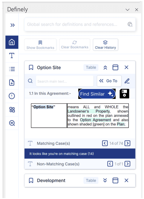
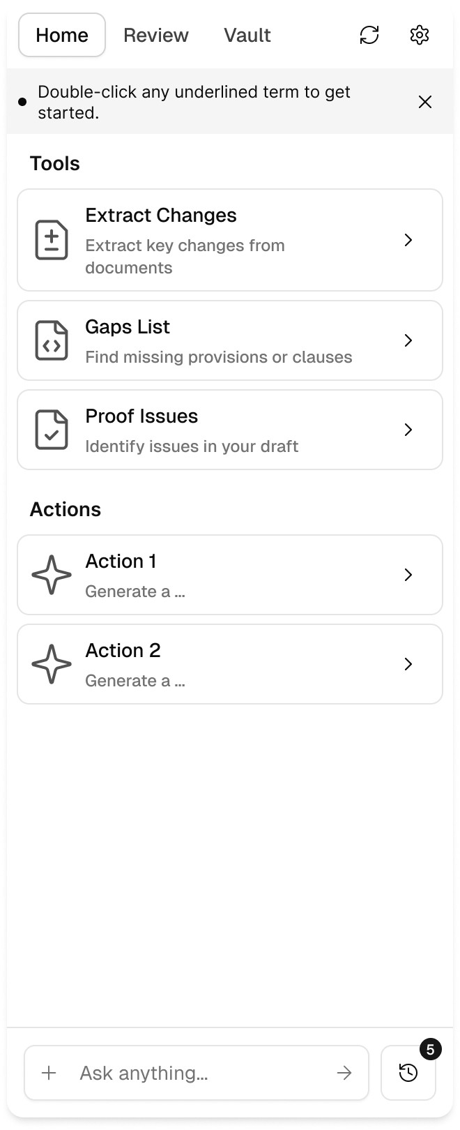
Before and after: live product screens showing the problem, and the redesigned suite showing the solution.
The before screens show the live product when I joined: five isolated tabs (Cascade, Draft, Proof, Vault, Enhance) with no shared context between them. Users had to navigate into each tab to discover its functionality, and switching between products mid-workflow broke concentration. The after screens show the unified system: Cascade becomes the intelligent entry point that surfaces relevant functionality from Draft, Proof, Vault, and Enhance based on what the user is working on. Tabs still exist in the navigation, but people no longer have to open each one to find what they need.
← Before
Live product when I joined Definely


→ After
Redesigned suite: a single coherent product inside Word



The project schematically:
Alongside the navigation redesign, activated users grew from 6,441 to 16,856 (+162%). The design system stayed the foundation as the company grew from 30 to 100+ people. I received Definely's Grit Award in 2025. In 2026, I designed the connector experience for Definely's MCP integration with Claude and ChatGPT; the Claude connector shipped in Anthropic's 'Claude for the legal industry' launch.
What three years as Definely's first designer taught me.
+162% activated users alongside the redesign · Design system still the reference at 100+ people
The 320px panel taught me more about typography, spacing, and progressive disclosure than a wide canvas would have.
What I'd push for next.
Continue scaling the design system as the product team grows from 2 to 5+ designers.
Deepen AI trust patterns, building on provenance and history to give lawyers full traceability on every output Definely produces.